When I am teaching in person, I circulate around the room. When I first started teaching, I would circulate in similar patterns, winding my way through the desks and rows in ways that would probably form well tread ‘desire paths’ along the floor tiles. Later, I developed a few different pathways through the room, in an attempt to connect with all students.
There are, invariably, some students I want to visit with greater frequency. Maybe they are students that benefit from proximity to a teacher. Maybe they are students that are more likely to need a helpful question, or a small scaffold. Maybe they are students who have traditionally struggled in math class, and struggle with confidence to persevere.
All of these ‘maybe’ scenarios are filtered through my own biases. No matter how much the students may agree with my hunches about who benefits from support, they’re mostly my own perception. There are some students that would also benefits from these supports that I unintentionally neglect.
To break my own habits, I printed out class lists and recorded notes about student thinking. I paid attention to students with blank or sparely written boxes next to their name. How could I learn more about them? What was I missing? How could I explore their thinking while also offering the supports I believed these other students needed?
I worked deliberately to interrogate my own instructional habits and perceptions of students. Then: the Desmos dashboard opened up more possibilities.
The Desmos Dashboard
As a remote teacher for all of the 2020-2021 school year, Desmos was my oxygen. I used it almost every day to facilitate lessons. There were so many ways for students to interact with mathematical content, more than I could possibly enumerate here. Students shared their responses with me and with others in the class. They explained their thinking in in words and through visuals. They played with mathematical representations, estimated values, and tested out conjectures.
I love using paper — #TeamBlankspace — but I have a new and radical appreciation for the Desmos Dashboard.
While facilitating an activity, I am able to view student work in different ways, like the work samples are part of a database. Sometimes, I look to see one student’s progression of understanding over the course of an assignment. Other times, I look at everyone’s work for a key problem, especially one that I am planning to use an anchor for class discussion. It is like being able to sort the work in different ways.
My students loved Desmos, too. Like maybe kids in one class designed mascots for the company… (Introducing: Dessie the Des-pig and Bessie the Des-cow)
Anchoring Discussions
For most of the year, I used the IM 6-8 Math curriculum. I made certain to identify which tasks, or parts of tasks, I wanted to use as an anchor for class discussions. In the teachers guide, this is named as the activity synthesis.
Here is an example from Grade 6, Unit 1, Lesson 3 (one of my faves):
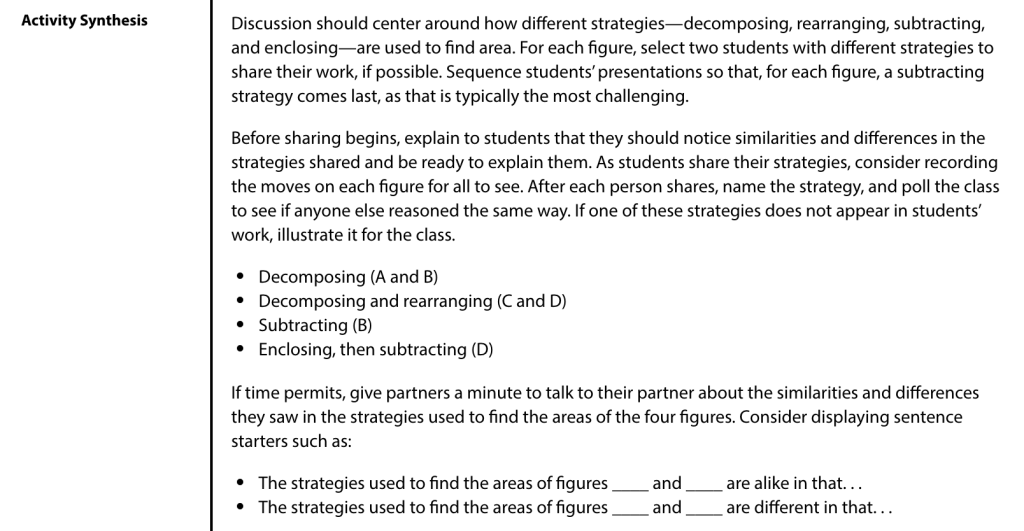
The teachers guide identifies what the discussion should center on, and frequently provides ideas for how to sequence student work to achieve the lesson objectives. (This is labeled “Anticipate, Monitor, Sequence, Select, Connect” in the curriculum, which are also known as the Five Practices for Orchestrating Productive Discussion.) Honestly, it’s a revelation! This guidance allowed me to focus more on student thinking, both in my preparation and in the moment.
Desmos provides similar guidance in their new middle school curriculum. Instead of written in full prose format, the teacher moves (like what you’d read in the teachers guide) are available on each slide.
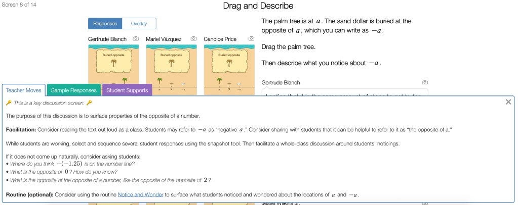
Some screens say that this is either a potential screen to use for discussion, or…
🔑 This is a key discussion screen. 🔑
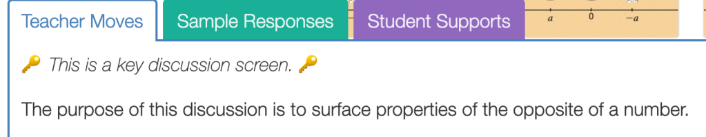
I did not have to glance down at a notebook to remember which was the key screen for discussion. There it is! With an emoji!
Monitoring Student Thinking — About ONE Question
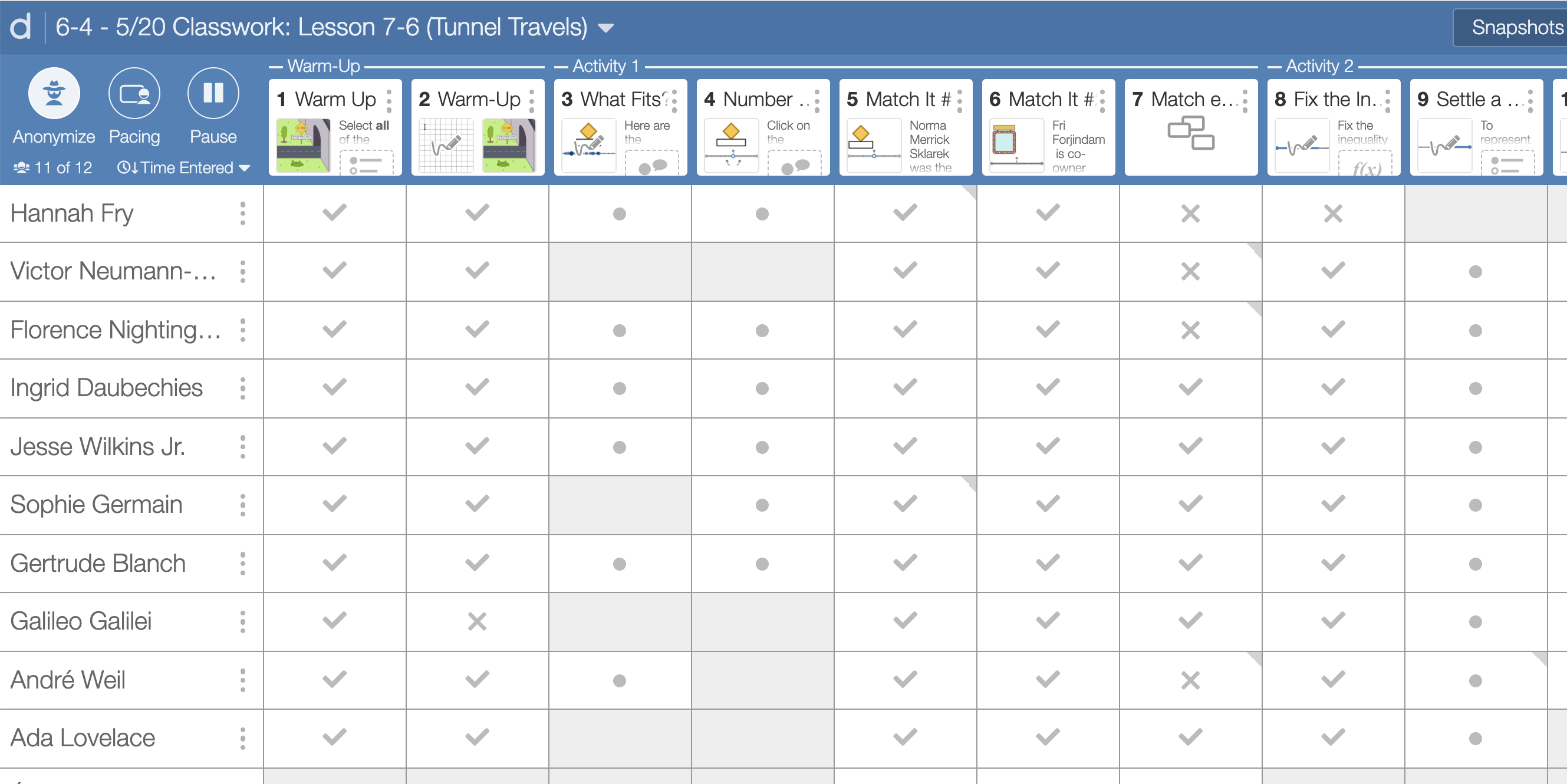
I would click on this screen, and then I could look at the student work samples for every single student. I didn’t have to peer over shoulders, or crouch down next to student desks, in order to see it, too! It wasn’t luck that I saw certain work samples: I could easily scroll through everyone’s work.
After examining everyone’s thinking, I was able to write feedback directly onto Desmos, or pop into a breakout room to ask students more about their thinking.
Selecting Student Work & Making Connections
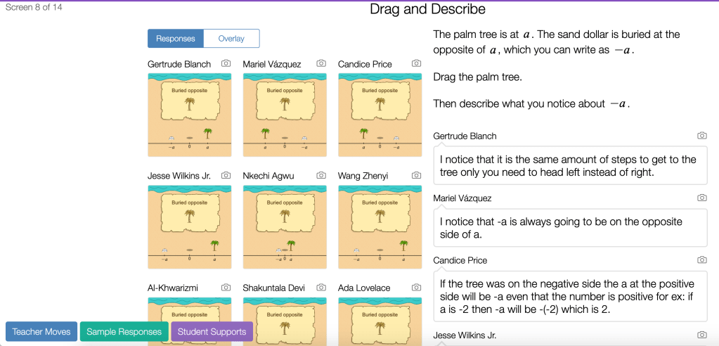
I used the snapshot tool to take ‘photos’ of student responses, and position them for review during a discussion. Here, I wanted to examine different conceptions about the word ‘opposite’ in relation to positive and negative numbers. I started with “Gertrude’s” thinking because it got right to the heart of the matter: these numbers are the same distance from zero. (These are, again, pseudonyms courtesy of the ‘anonymizer’ mode.)
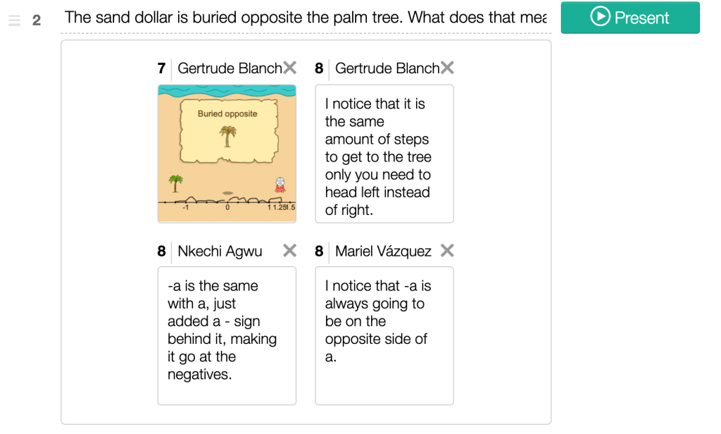
From there, we looked at Nkechi’s and Mariel’s thinking. Their work had some beautifully imprecise bits to it: they had some functional ideas about what it means to be opposite, that might deepen student understanding, although Gertrude’s idea was more central to the concept.
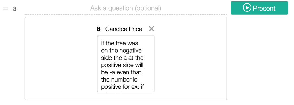
Candice’s thinking extended nicely from Mariel’s observation, so I showed it on the next screen. (When I click ‘present,’ the entirety of the work is shown, rather than the small capture in the screenshot.)
I was able to capture the exact thinking that I wanted to share. I used a physical notebook to keep track of whose thinking I amplified during discussions, as well, as part of my commitment to examining my own bias and positioning of students within a classroom. This goes back to the concept of ‘discretionary spaces,’ which I have written about a few times.
With the Desmos dashboard, it was easier than ever to make certain I was showcasing work from different students, including ones that may think of themselves as low status within the math classroom.
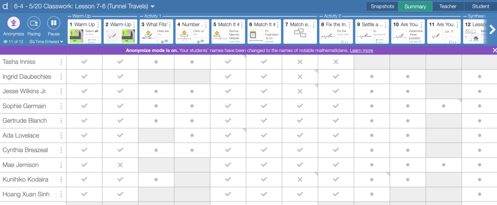
The Anonymizer
I typically kept my students’ actual names showing on the dashboard as they worked. (Students are able to change their name when they log into an assignment. This seemed particularly important for trans and non-binary students who did not want to be called by their deadname, and students who used nicknames that were different from their birth name, especially EL students.)
But sometimes I put the anonymizer on, so that I couldn’t view the students’ work through the lens of my preconceived ideas about who they are as a math student. I could even leave them feedback without any ideas about their identity or perceived status within math class.
This was more powerful than I had anticipated.
In the 2021-2022 School Year
I will be teaching in-person again starting in September! Our middle school has adopted the Desmos Middle School Curriculum, which is inspired by IM 6-8 Math/Open Up. This means that all of the middle school classrooms that I work with will be frequently leveraging the Desmos dashboard.
The elementary classrooms I work with will likely be using other physical and digital materials, which leaves me to think about ways that I can continue this work — reducing teacher bias — in ways that go beyond my old notebook strategies. The mental load while teaching is heavy, and there’s so much to juggle while we are also trying to learn about student thinking. How can we learn about as many students as possible, within the constraints of our positions?
Discover more from Jenna Laib
Subscribe to get the latest posts sent to your email.

1 Comment